Menu
visual techniques
COMPOSITION AND REPRESENTATION
Why are images so powerful?
Images are highly evocative, this means that they elicit a strong emotional response in the viewer.
Images are processed cognitively more quickly than written text, so meaning can be conveyed quickly and effectively through imagery.
Images are open to interpretation- they can appeal to many different viewers and they can be used in many contexts. However, they are open to social, cultural, contextual and individual variation in the meanings they convey.
How visual texts are composed
How meaning is made- the techniques of visual representation..
GAZE
Refers to where the figure in the image is looking.
DEMAND- a term used when a figure in the image 'gazes' directly out of the page at the responder. This establishes a connection between subject and viewer.
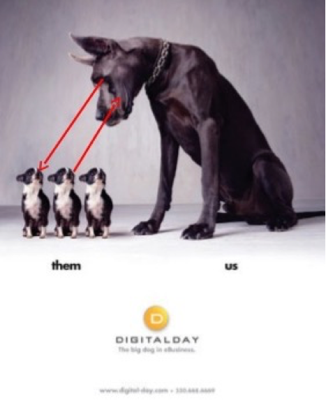
OFFER- a term used when a figure 'gazes' at another object in the image encouraging us to look at that object, the viewer is a detached onlooker.
READING PATHWAYS
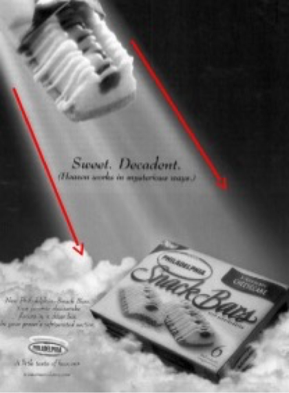
A reading path is the path you take through a visual text. The path moves from the most salient to the least salient elements.
In other words, it is the movement of the viewer's gaze around a visual text. This can be influenced by elements such as vectors, Salience, gaze etc.
VECTOR- A vector is a line that leads your eye from one element to another. A vector may be a visible line or an invisible one. It can be created by such things as against, pointing fingers or extended arms. They may be objects or parts of objects (such as arms, legs, a pole, the side of a house) or invisible lines such as the direction of gaze from a represented person's eyes to another person or object.
SALIENCE ( focal points)- The element/s in an image which stand out and attract the viewer's attention, it refers to the feature in a composition that most grabs your attention. An image can be made salient through
FRAMING- elements in a layout can be disconnected and marked off from each other or connected. If elements are cut off from one another they are strongly framed. Framing can be achieved by borders, this discontinuities of colour and shape, for my white space. Connectedness can be achieved by vectors and devices such as overlapping or superimposition of images.
PERSPECTIVE
FOREGROUND/ MIDDLE GROUND/ BACKGROUND - what is in the foreground is often considered more important than what appears in the background.
POSITIONING OF ELEMENTS eg centre or off-centre
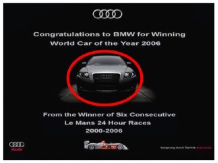
CENTRALITY - centrality refers to placing of the main object or figure in the centre of the image or close to the centre of the image. Images in the centre are the nucleus information, the margin images are subservient.
COMPOSITIONAL AXIS
the vertical axis - the left is known, the right is new or unknown
the horizontal axis- the upper section is ideal, the lower elements are real.
IDEAL/ REAL - when the page is divided horizontally, top and bottom. The top of the page is often called the 'ideal'. In advertising the product is usually placed in the ideal. What has been placed at the bottom of an image can be said to represent the 'real' and usually contains information about the product.
JUXTAPOSITION
Placing visual elements side by side to create contrast or interaction. The placement of two or more ideas, characters, actions, settings, phrases or words side-by-side for a particular purpose, for example to highlight contrast or for rhetorical effect.
SHOTS AND PERSPECTIVES
Viewing angles and distance are very similar to film shot. For example, 'low angles' make the subject look more powerful while the reverse is true when a 'high angle' is used. A high angle makes the viewer feel a sense of power and a lower angle makes the viewer feel powerless. A straight on eyelevel view creates no power difference. Like in film medium, illustrators use 'shots' for different purposes, for example close-ups, long shots etc.
SOCIAL DISTANCE
A close-up is intimate and creates a connection with the viewer whilst a long shot creates objectivity and distance. With a long shot or an objective image of you is not drawn into involvement with the image. Meaning comes from the symbolic connection made by the reader.
MODALITY/ CREDIBILITY
SYMBOLS
symbols can be used to represent ideas or concepts.
LIGHTING
COLOUR
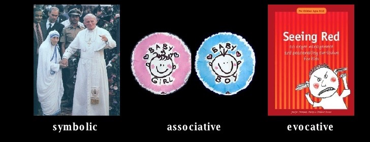
Colour is an element strongly tied to our emotions. Depending on the context, it can have symbolic, associative or evocative meanings.
HUE- red, green, blue etc
VALUE- the brightness of colour- light/ dark
INTENSITY- describes Te purity or strength of a colour: bright or dull
'Hot' colours- excitement, happiness, anger
'Cool' colours- harmony, peace, sadness
Placement of certain colours near each other can prompt mood, or draw attention to certain features
Media used can emphasise colour, eg luminous watercolours, gouache- more intense.
ART ELEMENTS
Texture-
Refers to where the figure in the image is looking.
DEMAND- a term used when a figure in the image 'gazes' directly out of the page at the responder. This establishes a connection between subject and viewer.
OFFER- a term used when a figure 'gazes' at another object in the image encouraging us to look at that object, the viewer is a detached onlooker.
READING PATHWAYS
A reading path is the path you take through a visual text. The path moves from the most salient to the least salient elements.
In other words, it is the movement of the viewer's gaze around a visual text. This can be influenced by elements such as vectors, Salience, gaze etc.
VECTOR- A vector is a line that leads your eye from one element to another. A vector may be a visible line or an invisible one. It can be created by such things as against, pointing fingers or extended arms. They may be objects or parts of objects (such as arms, legs, a pole, the side of a house) or invisible lines such as the direction of gaze from a represented person's eyes to another person or object.
SALIENCE ( focal points)- The element/s in an image which stand out and attract the viewer's attention, it refers to the feature in a composition that most grabs your attention. An image can be made salient through
- Placement -usually an image becomes heavier if placed towards the top or left of the page
- colour
- Size
- Focus
- Distance
- Or, a combination of these
FRAMING- elements in a layout can be disconnected and marked off from each other or connected. If elements are cut off from one another they are strongly framed. Framing can be achieved by borders, this discontinuities of colour and shape, for my white space. Connectedness can be achieved by vectors and devices such as overlapping or superimposition of images.
PERSPECTIVE
FOREGROUND/ MIDDLE GROUND/ BACKGROUND - what is in the foreground is often considered more important than what appears in the background.
POSITIONING OF ELEMENTS eg centre or off-centre
CENTRALITY - centrality refers to placing of the main object or figure in the centre of the image or close to the centre of the image. Images in the centre are the nucleus information, the margin images are subservient.
COMPOSITIONAL AXIS
the vertical axis - the left is known, the right is new or unknown
the horizontal axis- the upper section is ideal, the lower elements are real.
IDEAL/ REAL - when the page is divided horizontally, top and bottom. The top of the page is often called the 'ideal'. In advertising the product is usually placed in the ideal. What has been placed at the bottom of an image can be said to represent the 'real' and usually contains information about the product.
JUXTAPOSITION
Placing visual elements side by side to create contrast or interaction. The placement of two or more ideas, characters, actions, settings, phrases or words side-by-side for a particular purpose, for example to highlight contrast or for rhetorical effect.
SHOTS AND PERSPECTIVES
Viewing angles and distance are very similar to film shot. For example, 'low angles' make the subject look more powerful while the reverse is true when a 'high angle' is used. A high angle makes the viewer feel a sense of power and a lower angle makes the viewer feel powerless. A straight on eyelevel view creates no power difference. Like in film medium, illustrators use 'shots' for different purposes, for example close-ups, long shots etc.
SOCIAL DISTANCE
A close-up is intimate and creates a connection with the viewer whilst a long shot creates objectivity and distance. With a long shot or an objective image of you is not drawn into involvement with the image. Meaning comes from the symbolic connection made by the reader.
MODALITY/ CREDIBILITY
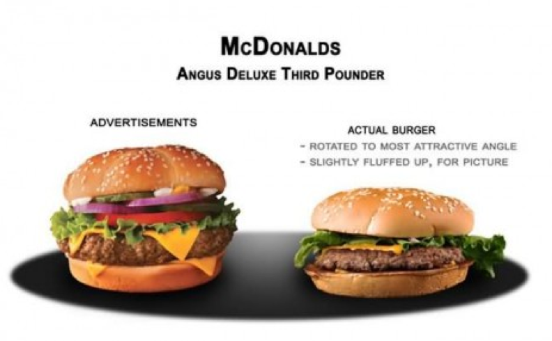
- Lowest modality graphics are the least real
- highest modality is most real
- influences on modality are:
- Idealisation -the images better than real
- Decontextualisation - Components are removed from the expected context and used elsewhere.
- Modality can be affected by tricks with perspective
SYMBOLS
symbols can be used to represent ideas or concepts.
LIGHTING
- Lighting create mood
- Shadows may suggest concealment of fear and despair
- Light, hope and inspiration
- Soft light,Romance
- Colour can be symbolic
COLOUR
Colour is an element strongly tied to our emotions. Depending on the context, it can have symbolic, associative or evocative meanings.
HUE- red, green, blue etc
VALUE- the brightness of colour- light/ dark
INTENSITY- describes Te purity or strength of a colour: bright or dull
'Hot' colours- excitement, happiness, anger
'Cool' colours- harmony, peace, sadness
Placement of certain colours near each other can prompt mood, or draw attention to certain features
Media used can emphasise colour, eg luminous watercolours, gouache- more intense.
- Red red colour red represents action, passion, masculinity, emotion, danger
- Yellow represents warm colours, cheerful, joy, lightheartedness
- Blue represents coolness, calmness, wisdom new point
- Black represents evil, mysterious, powerful, fear
- White represents purity, innocence,timelessness, mystical
ART ELEMENTS
Texture-
- Connecting the sense of sight with the sense of touch/ feel
- Can rouse memories, and create empathy for character and setting
- Use of media influences texture.
- Can create mood
- curves- warmth and safety
- jagged, sharp- excitement, destruction, unease
- line can draw attention to something in the illustration
- liberal use of space indicates isolation, emptiness
- busy illustration can infer chaos, lots of activity, energy
- space can also draw attention to specific objects
- visual outline of an object which we use to recognise objects
- rounded- warmth, safety
- angular- excitement, confusion
- use of object/ character size can convey different emotions
- scale or size is often used to indicate the importance of something.
SOME EXAMPLES OF TECHNIQUES
READING PATH
VECTOR- line
TEXTURE
ideal - real
GAZE- demand
GAZE- offer
The dog's GAZE creates an OFFER encouraging us to look at the puppies
CENTRALITY- the central positioning of the car creates salience
LINE AND COLOUR
JUXTAPOSITION
FRAMING, CENTRALITY & RULE OF THIRDS
COLOUR
SPACE


